A couple of weeks ago, I posted up a few quick notes in regards to some trend following rules in order to get this blog moving again. Today, I am literally writing a response to a question I received in the comments. Like most questions I get, they are not easily answered in one or two sentences. But because the situation can be so delicate and difficult to navigate, I wanted to explore it further. So let's get on with it:
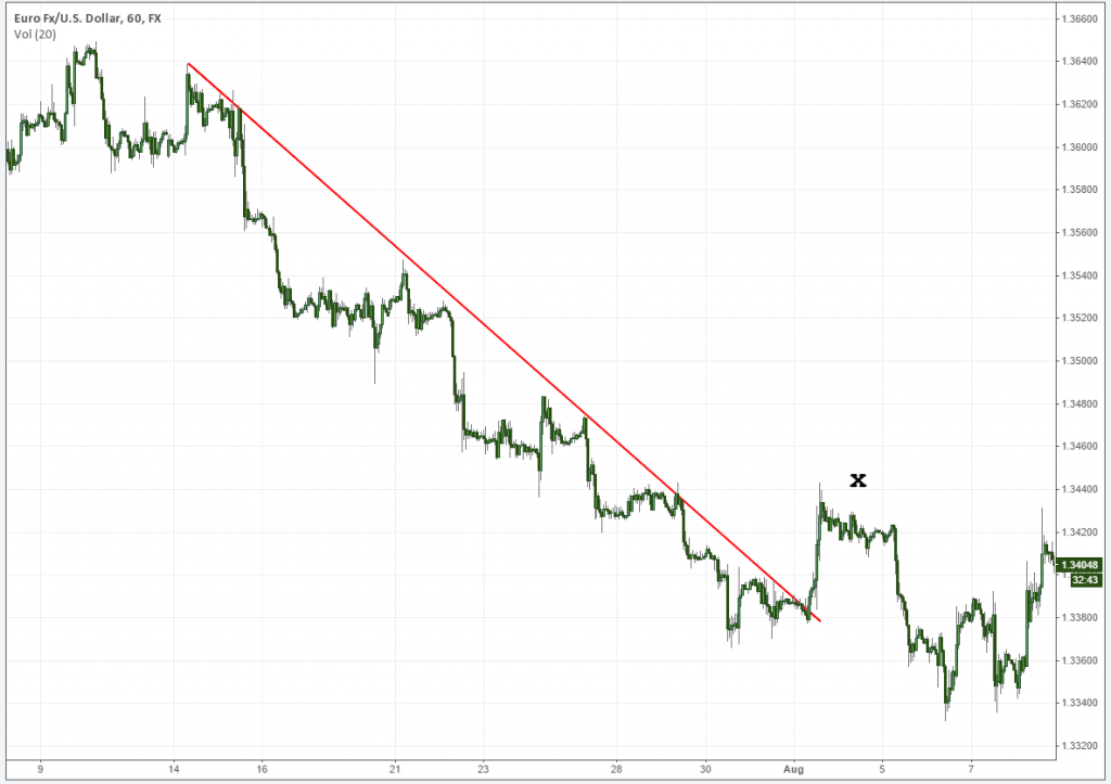
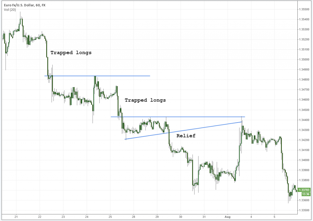
The question was in regards to whether or not trends will continue or fail when a flag is seen going against them. A lot of traders get hung up on this concept and trapped in what usually turns into a very ugly situation. Here is the chart (copied from last week's post) in question:
Essentially we have what is commonly regarded as a “bullish” flag created in the backdrop of a more macro, bearish environment. The flag fails, triggering heaps of orders prime for dissection, and the trend continues lower. There is also another example of this happening in the upper left quadrant of this chart (which is also an over and under).
So the mystery: how do we know this flag is going to continue, or fail? There is no cut and dry answer for this, but more than a few tools to help us out. I'm going to cover these in list form, but in no intended order, in an effort to make this easier to understand:
1. Has a macro trendline broken and /or local levels being used as support?
Such a simple question, but for some reason many people either want to ignore it or believe there is some other complex method coming into play. When the flag is created above a more macro trendline breaking, and the flag itself is being supported by a local structure, the directional bias has gone no where.
In the example above, the macro trendline went bust right at the inception of the first drive (shown below). This is very normal behavior and does not mean that a trend is over. In most cases, it simply means that the trend is simply starting to expand. After the initial fanfare goes away (the reason why everyone was selling so aggressively) profits are taken and price relaxes.
And then there is the story of local levels. I always prefer to use local levels in order to assess short term momentum.
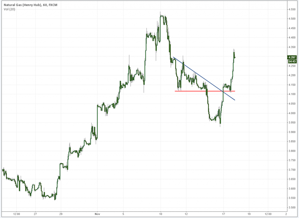
A perfect example of this occurred on Natural Gas today (I have been trading it a lot these days due to where I work). Price broke above the more macro trendline and Over and Under support to propel it higher. Note the lack of countertrend rejection after the initial spike (discussed below), and that the movement itself was targeting a spike base.
2. Look for condensing flags in the direction of the movement.
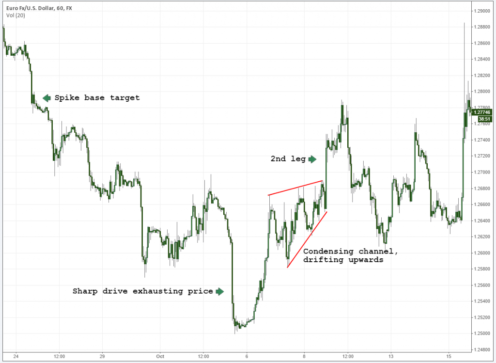
Expanding prices tell us that the market is getting “confused”. An opinion is present in both directions. This indecision tends to take time to fan out before a direction is declared. Your “best friend” flags (that point to a second leg) come in the form of condensing channels that drift in the direction of the movement itself. As follows:
Prices shot higher, and immediately started to condense. While being rejected, the local base held up as the peak itself condensed further. Eventually, of course, it broke out to the upside.
This topic can be exhausted in and of itself. You will notice that the condensing channel above is essentially a triple tap that continues trading higher. Triple taps that fail versus those that continue have very distinct characteristics. I've already started writing a post regarding this and plan on getting it up soon.
In a nutshell (as in this case), prices remain condensed. They never expand (break below the lower channel line).
3. Look at the structure leading into it. Was the move itself sharp, or a drifting channel?
This is subtle, but very important. Prices like to exhaust on sharp drives, or what most people would consider to be “aggressive” behavior. Modern quants have amassed fortunes on time-sensitive volatility like this, and a lot of turnover is expected. When prices don't finalize with a sharp drive, they can be completing nothing more than a standard cycle. The chart above has already shown this, where we have a rather parabolic movement leading into an ultimate failure in price.
Volatility is most commonly found in two key places: at the inception, and towards the finale of trends. The first of these (the inception) is more difficult to asses. These “easiest” instance in which you will find this happening is when you have a counter movement leading into the reversal, which is sharp (think V reversal).
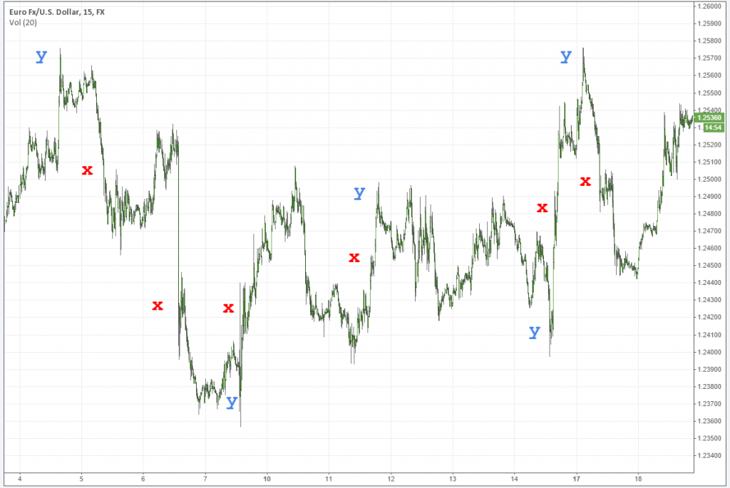
In the following example, red “x”‘s mark breakouts in an opposing direction. Blue “y”‘s demonstrate sharp movements that get rejected. Please note that I tried to not get too carried away in marking it up, and omitted anything that would not be considered more volatile.
When looking at this chart, think about what is happening after the “y” spike occurs, and whether it is fading or following the trend. Note that red “x””s that follow blue “y”‘s generally result in easier-to-identify outcomes.
4. Mind the local structures
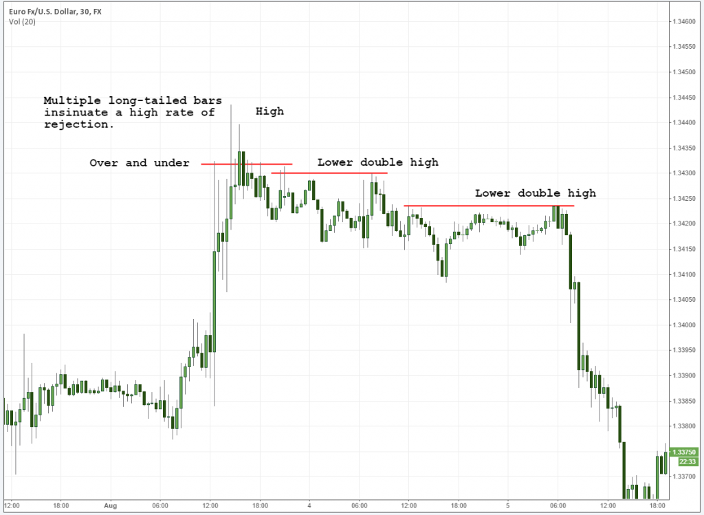
Double tops and bottoms escape the radar of many people. I assume this is only because they are widely misunderstood. When seen on a short term basis (and more importantly, in the context of a trend) they tell us a compelling story: Pressure is in the area, and local attempts have a high rate of failure. Highs followed by lower or higher double highs complete a common pattern (which I refer to as square roots, based on their shape alone). When present in flags, these are essentially warning signs that bears are out hunting and ready to keep the macro move rolling along.
5. Look for high rates of rejection
Individual bar patterns can also be used appropriately because we are, in essence, still trading a trend. To the left of the chart above, we can clearly see that the market was rejecting these highs with earnest.
I'll use hourly charts to look for high rates of rejection on individual bars. While certainly never the end of the story, they tend to be very absent from moves that ultimately reverse the trend and turn into a second leg. You will notice that in our second chart above (Natural Gas) you're not going to find a high rate of rejection after that first leg higher. And on our second chart, rejections were present, though we experienced condensing drift in the move higher.
Also, I should note here: when these bars get “eaten up” (a close in the tail portion of them) – follow that move. It's not stopping.
6. Finally, what are we bouncing off of?
The market will “trap” the rest of the market in a trend, using older areas of supply and demand as a propulsion zone. In trends (and at the inception of trend reversals) prices like to reject these areas on a consistent basis.
Our old friend the spike base demonstrates this behavior happening over and over again.
1. A heavy injection of supply or demand enters the market.
2. Price starts to consolidate, and fresh pressure enters.
3. That fresh pressure is used as a propulsion point in the future.
Bear in mind that spike bases can be used just as much as targets as they can a point of failure, so trade accordingly. Always be aware that markets are drawn to these like super-magnets.
The Perfect Storm
In most cases, you're going to find a confluence of factors, in which case you're of course going to want to take action. The tighter prices wind, the more prone they are to a breakout. Just be sure that you're on the right side of it.
In summary, assess your overall environment look at the drift of the move, and whether or not prices are condensing or expanding. Use local structures as well as individual bar patterns to see beyond the uneducated obvious. Gauge your momentum, and you should find yourself in a favorable situation.
And so that will do it for this week. As usual, please post any comments below and give us a hand by sharing this article if you found it all useful.
Thanks and good trading,
Steve


