Trend trading can be an extraordinarily difficult thing to master, and indeed, most people rarely do. Buying low and selling high is programmed into our brains from such early days of trading to the point that when it comes to shift gears on heavy-trending days, doing so is nearly impossible. From a personal standpoint, trend trading was the very last thing I learned to do, because it was just that hard to figure out.
I was missing confirmation in my entries. Google “trend trading strategies” and you're likely to come up with a host of pages telling you to sell at pullbacks to fixed-number exponential moving averages, etc., but you have no meter for consistency. These moving averages or other means of trend support or resistance are derived from specific instances and I can tell you, at least from a systematic standpoint, this type of method has a low win rate.
It's because as symmetrical as the market can be, it changes, and can become entirely asymmetrical when any form of fundamental stimulus is introduced……and this happens all the time. “V” tops and bottoms occur, and the trend itself can exist at any angle. You could have a slow and steady trend at a low angle, or a sharp, parabolic trend at a steep angle. A fixed-number EMA will not work in both circumstances, on the same timeframe. On the lower-angle trend it's going to break. That's just common sense.
Now there are ways to perfect this, of course, and many people have, but the underlying problem isn't solved: what specific levels are truly going to act as a launchpad for price acceleration?
So in my search, I turn to the obvious: diagonal trendlines. These suckers are common culprits of just about anything on your chart, and using them is heavily misunderstood, as I discovered later in my career. But before we get too involved, let's talk about the first thing we should know about any trend:
How Do We Know A New Trend Is There In The First Place?
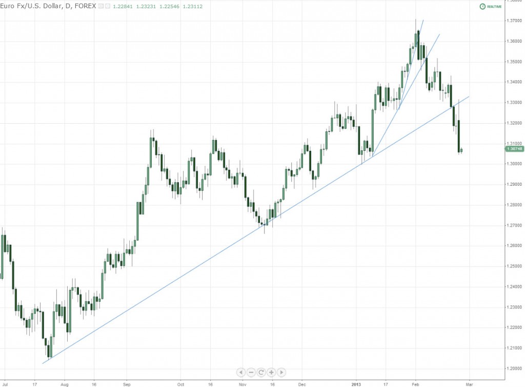
A newly-developed trend has one indisputable major characteristic: a broken trendline from a previous trend.
Contingent on the timeframe, the length and seriousness of the move is going to vary. A trendline break on a 1 minute chart can't come close to touching the significance of a trendline breaking on a daily chart. And when this happens, everyone pays attention. It's a very big deal, so don't underestimate it.
Next, as I've explained before, trendlines can be “fanned” to show progressively steeper angles of the trend. This is an old term/technique, explained below that serves a variety of purposes. The “norm” is 3 progressively steeper trendlines prior to a break of the last.
You can see that the lower the angle of the trendline breaking, the more significant the move becomes. And depending on the interval of the break, you will see more and more activity shifting in that general direction.
Once the trend is underway, you can become overwhelmed with reference points. Our job today is to help clear up a large portion of that.
Find Those Strong Turning Points
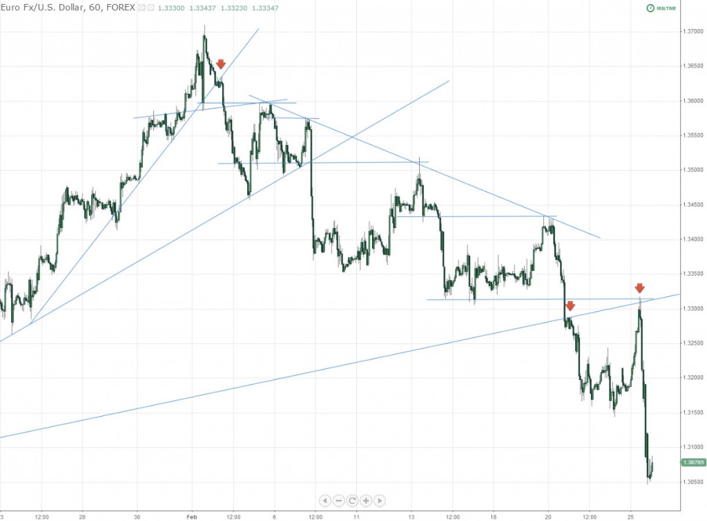
Below is that same chart, zoomed in to an hourly timeframe with horizontal support/resistance levels added. I want you to notice three things here:
1. Not a single major high in this trend bounced directly off of the bottom of a previous range, “to the pip”. Every single one of them intersected the previous wicks of the candles in a failed attempt to beat out the previous trading range.
2. Every single one of these highs shows some form of confluence (others not marked up on this chart).
3. The red arrows, which I would like you to pay particular attention to, that use the trendline itself as a launchpad for momentum.
Now as easy as this is to show after-the-fact, trading these highs can be an extremely difficult process. Most traders would have a hard time finding a couple of these, never mind all of them. And while we have short-term methods to find these highs, not discussed in this post, knowing they exist after-the-fact is still enough to help us out tremendously when it comes to riding the wave.
On point #3 above, I said to pay attention to the backward retests on these trendlines. These movements became my short answer for years of struggling with trends. While simply impossible to catch all absolute highs and lows, I needed another means of entering once the move was underway.
Reference Point Gold
Your charts are basically made up of….
…ranges, with sharp movements in price. On that hourly chart above, you have a sharp move lower, a range, a sharp move lower, a range, etc etc….and this is what happens in trends. What this gives us is gold in the form of reference points, when the sharp move is underway, derived from the previous range.
Let me explain:
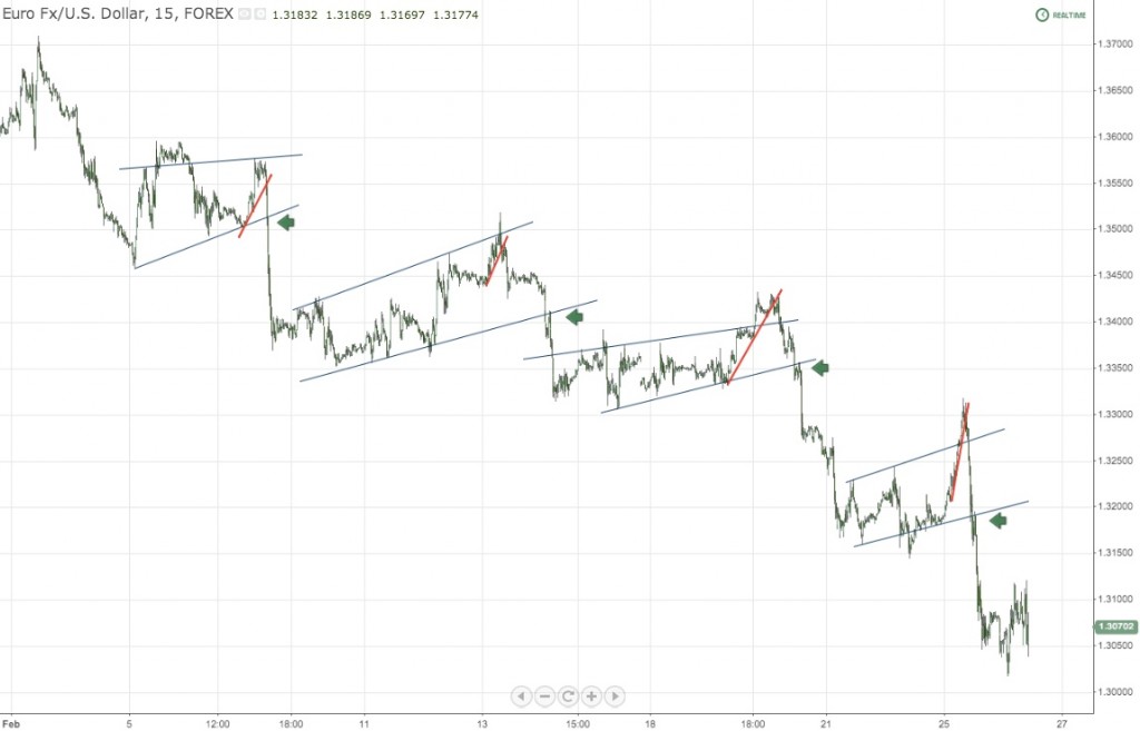
Each one of these “ranges” in a trend are usually made up of flags or pennants (normal or inverted). And knowing this fact alone gives us yet even more to work with once the next sharp move is underway. Let's take one more look at that chart (now broken down to a 15 minute version to retrieve more detail) from yet another perspective:
So now we're starting to get closer in terms of working with these. You'll notice several things happening:
1. All of these formations are CAN be pennants, but I choose to disregard the initial drives lower and draw them as flags. The bases of the flags become relevant for backward retests on these trendlines (green arrows), as price uses them as an intraday launchpad for acceleration. This allows you to look forward and get in on the move earlier.
2. The upper (blue) trendlines are also commonly used as launchpads to take price higher, but not by much. This is a very common occurrence, and not just within trends. Take note.
3. When the red trendlines break, they all retest on the back end. When the do, price accelerates, breaks the upper flag line and heads lower.
So right out of the gate, we have 2 possible entry points: 1. a break / backward retest of the upper diagonal trendline (red trendlines) or 2. a break of the base of the flag.
But wait, there's more (and hopefully I haven't lost you yet – if I have, please go back)
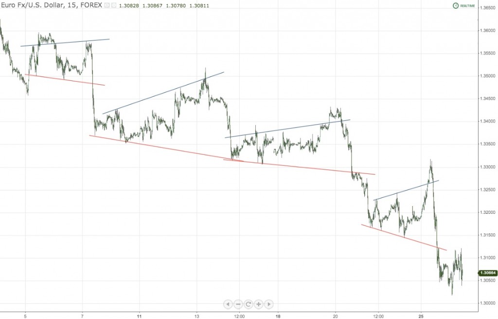
Remember how I said that I can draw these as pennants, but chose not to initially? Well, the market doesn't forget about those lines either. The reason they come last, in my book, is because they're literally the last ones to get hit, but you should still use them when you're trading intraday. Take a look:
What I did here was just change the lower trendline (now highlighted in red) to move in the direction of the trend, as opposed to against it. You'll see that in one of these instances, it was used as support, and the last two, as launchpads for drives lower, in the direction of the trend.
Inside the Channel: Adaptive Entry Points
Now that we know how to determine if a major move is underway (and have points of entry at the top and bottom of the flags or pennants) what about all of the activity in between these lines?
Let's go to a recent example, on a 5 minute chart, to show what happens once all of these downward movements are underway.
The high on this chart is the backward retest on the daily chart (last leg lower in the examples above). This alone is a very big deal. It is a descending triple tap, which in and of itself is a strong reversal indication.
The green arrows on this chart show all possibilities for intraday entry using this method. In a nutshell, price breaks through a previous trendline with confluence, and uses it as a launchpad for the next leg lower. There's a big question with my basic methodology here though, which I'll explain in a second. First, just take a look at the chart:
So what' that big question I was talking about? Well, if you were to try to do this live, in real-time, you're might be asking yourself: “How do I know which lines to use? There are tons of them!”
The answer is as follows and as basic as everything else we do here:
First, look for the historical hits, aka confluence. These trendlines are buried everywhere in your chart and most people don't even see them. Do you remember those paintings you had to stare at long and hard before you saw a 3D image appear? They're called 3D stereograms, and you basically had to relax your eyes and stare at one central point in the picture and voila, it starts to pop out at you and you're able to see the “hidden image”. Finding these lines can in a way, be very much like that. Just start drawing, and you'll start to notice them everywhere, acting as reactionary points in the future. Practice makes perfect – be relentless.
Second, work your way backwards.
My few words of advice for successfully finding the ones that matter is to start at the right side of your chart, and work your way backwards. People like to see things clearly, and in the heat of the moment, flipping back through tons of history is no help to you at all. Any trader on a desk is going to think the same way. It as to be right there in front of you.
Start with the legs on the previous moves up. You'll notice that on all of the examples in this post, at least one touch came from the last move higher before the fall.
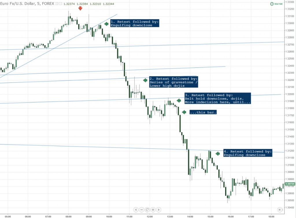
Third, if going in right at the point isn't you cup of tea and you like more confirmation, you can use simple bar patterns to confirm the reversal. Let's take yet another look at that chart, this time observing basic bar patterns:
The big take-home here is that the engulfing bars with downcloses inside the range of the previous bar (1 and 4) provided much better immediate follow-through as opposed to dojis (which generally represent indecision) being present. I've overall found this to be true when it comes to these retests on inner, or just “hidden” trendlines.
Side note: for those of you that have been following me for a while, you notice that I've traditionally used bar charts – same premise here. I've switched to candlesticks in recent posts to help provide more confirmation for these entries. Just like anything else we do, if it helps, it helps, and I plan on covering much more of this going forward.
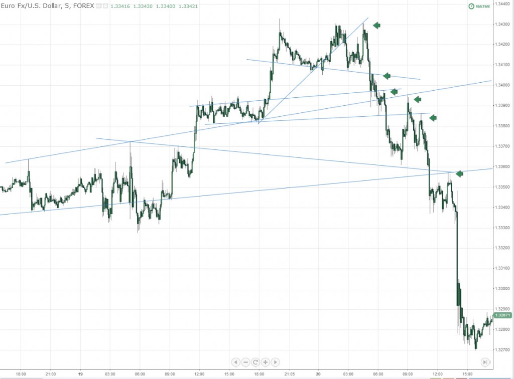
Let's take a look at one more example of this, using the previous drive lower in this trend:
Once Again, All the Crucial Points Are Here:
-Every trendline used for a retest has at least 3 previous historical hits. Any others (2 previous hits) are only used for confluence.
-Every trendline used uses a point on the last move higher as a reference
-Wait for these to break, and anticipate them being used as an acceleration platform in the not-so-distant future
-Reading individual bar patterns at time of entry is one of the best ways to confirm a trendline that sticks.
-When price enters the median of the previous range, pullbacks tend to get deeper.
So no order flow, no secrets, no magic, no nothing. Just trendlines. When your 8 EMA crumbles to little bits you can thank these trendlines for doing the dirty work. So start drawing them, and observe what's happening along the way. Nothing else can help you out more than your own personal application.
Yes, I know it's a lot for one day, but please take it in, and most importantly, start drawing. Thanks as usual for stopping by and see soon.
-Steve
—————————————————————————————-
All charts courtesy of https://www.tradingview.com/
Support our free site by sharing our posts with your friends and colleagues in any way, shape or form; every visit helps us out tremendously. Thank you.

