Today's discussion revolves around one of those topics that, depending on the level of experience of the reader, oftentimes provides an “ah-ha” moment. And when I have talked about today's topic in the past, I am humbly assured that my emphasis on them hasn't been strong enough. I learned about these many years ago, but only one variant, and struggled to apply them correctly. I was missing one simple thing, which is described below.
Without any hesitation, I can say that one of the top 3 issues people face in this business is knowing where to get out of their trades. The amount of focus put on trade entry can be completely nonsensical because you're never going to get where you want to be either using poor risk reward by snapping profits in seconds or without having any functional “architecture” to your trade assembly.
When we trade correctly, we are not just entering a position: We are forecasting a chunk of price action that has yet to occur. That's our job / our goal / what's required to make money. And that's the focus of this post.
Pinpointing a perfect trade entry is typically the first thing that comes to mind when people start digging for trading strategies and ideas. But finding good trade entry means nothing if we have no idea how long the move is going to last.
And no entry technique will work one hundred percent of the time, so we can't just simply snap at profits the second our position counter turns green. Additionally, we all know that exceptional risk reward equals longevity. But most people have an extremely hard time getting to the point of using good reward to risk because they don't know how to set reasonable profit targets.
Measured Movements
As it's now obvious, today we're going to get started on measured movements. I've already prefaced these as stating their value strictly in terms of taking profits, because that's where this particular article is going to place its focus. But there are multiple uses for these, as you'll start to see in the examples below, and as we'll discuss in future posts.
There are many, many ways of calculating future price movements. In this post we're going to discuss the one method I have been using the longest and can be learned and applied relatively easily, and in any market: Forex, Futures, Equities, you name it.
Others variants are going to be discussed in the future because simply stated: it's uncanny how well this market responds to these extensions sometimes. What's better is that, at least with the variants in this post, there is no ambiguity in terms of how to draw them.
If you would like a sneak preview at future writings you can check out this chart or this chart I posted to Twitter, Facebook last week, but I ask that you don't get too far ahead.
Now as usual, I have to state: none of this is new, with the exception of two variants I have personally found to work well that I haven't yet seen discussed elsewhere. And any explanations on the topic are, as usual, buried deep in the guts of books and the internet. Many institutional traders (and their algos…which is probably more relevant here) tend to revert to range extensions as a means of taking profits. I generally lean on the conservative side of these extensions in the event that I miss anything on the chart. I'm not perfect, I realize that, and being conservative in taking profits is my way of buying insurance on the trade.
It Starts With Good Entry…
We've talked about the high value of inner trendline breaks on this website in the past, but what about those outer (peripheral) trendlines? (for the newcomers, this chart quickly explains the difference between the two) I generally don't take breakouts on outer trendlines. I have found myself in too many undesirable situations well in the past to think about it for more than a few moments.
What happens so often is this: so many people are are looking at that trendline to the point when it finally comes time for it to get hit, price starts acting like a convoluted mess. When price finally hits the major ones and pokes through, I grab popcorn and watch, but I now rarely trade.
Why? Because it's not easy. Plain and simple. The following chart is a prime example of what I'm referencing – eyes on the red circle:
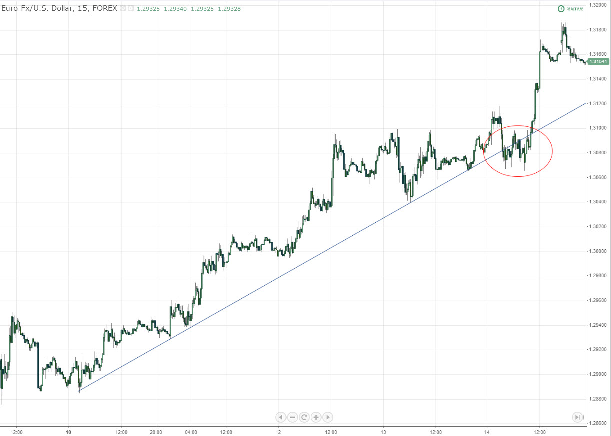
See that chunk of price? It's a no holds barred battle of bulls and bears fighting between a preexisting trend, a range, and potential reversal. And of course it's a horrible place to put on a new position short, expecting that trendline break to follow through (no confirmation here either).
Some people would try to sound more intelligent here and bother explaining the mechanics of that “false breakout” – but let's get serious: does it matter?…most people would lose their wallets in that mess (including the ones “explaining” it), and that's why I only now look for clean retests.
And this is also why we look for ways to enter above this trendline, in the event that something like this happens, using breaks / retests on inner trendlines, ascending or descending triple taps, double tops, or any other number of confirmation methods available. Always.
Once cleanly broken, however, that's another story, one which begins now:
It Ends With An Informed Take Profit…
Major, diagonal trendlines send a very clear signal to the world once broken. Longer term traders commit and the whole world gets queued in as to what the next major movement is going to be. Flows shift and a new momentum gets underway.
So when that trendline breaks clean , how far is it going to go? Just measure.
Take out your Fibonacci drawing tool and make a quick adjustment. Add the value 2.0. This is an extension, not a retracement. It should look like this:

2.0 is exactly double your measured range, or 100% of it added to your peak or trough. Simple. For the rest of this post I have removed all other numbers on the Fibonacci scale to make this easier to visualize.
Essentially what we're doing here is projecting a future price movement based on a witnessed break of a strong trendline…
Variant 1: Peak or Trough to Break (Conservative)
Oftentimes you'll see price running a little beyond this way of measurement, because as I stated in the title, this is the more conservative path to take profits with this method. We'll talk more about using these as reversal points in later posts. Please refer to the image (click to expand) for the appropriate explanation:

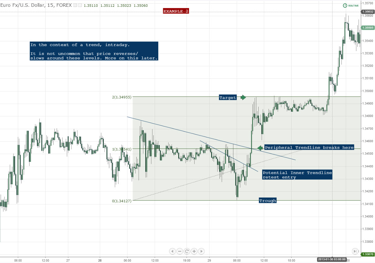
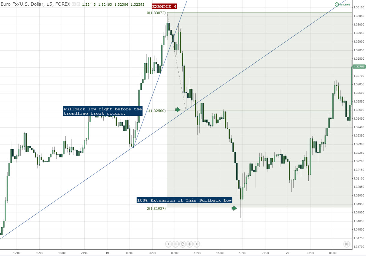
Variant 2: Peak or Trough to Pullback Before the Break
This variant generally yields more and behaves more favorably as a price turning point in the future. In the event of a strong breakout of a outer trendline, however (as in Example #2 above), you are simply unable to do this.
This example shows this variant on the same chart as the Example 1 above.
Not too shabby. Just start working with these and you'll gradually become more comfortable in terms of how they get hit.
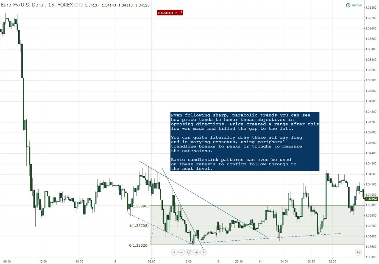
Variant 3 (and most commonly discussed): Peak or Trough to Trendline Point Below It
Once again, I am using the same chart as example 1. And for the record, I did not choose this chart because it fit so snugly with all of these examples. It was literally the first reversal I zoomed in on.
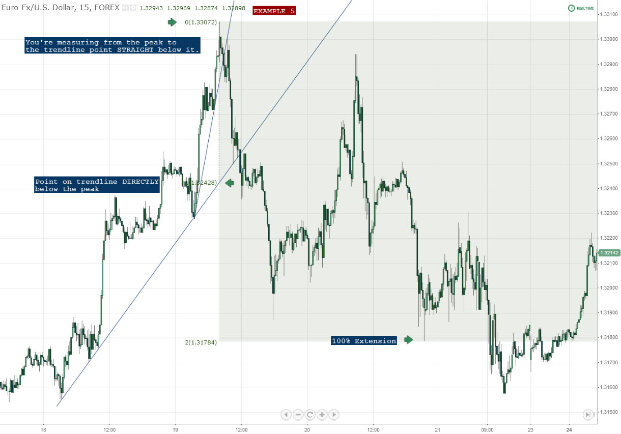
Have I scared you yet? If not, good. This should come as no surprise how cleanly these prices register. Behind every market move there is a plausible explanation, as ridiculous as it might seem sometimes. And this is just one of them that happens to occur quite frequently.
What to Look For and What To Avoid
Cherry picking charts that show this method “working” all the time does nothing but fill your head with the idea that it will do just that in all situations. There are certain things you need to be aware of before going into battle:
First, that “one simple thing” I spoke of in the beginning of this post was confluence. Traditional methods tell you to draw your broken trendline on the outside of price, but this trendline holds little value sometimes.
Confluence in the way your draw your broken trendlne is extremely important when it comes to this general concept, much more so when we start talking about fading these extensions. Draw your trendlines using the most historical hits possible, just like everything else we discuss on this site. If a pullback (retest) registers around your projected trendline, draw backwards and make sure you're looking at the right one.
Let's go back to that spike to illustrate this (3rd example in the 1st variant), using an outer trendline as a means of measurement.
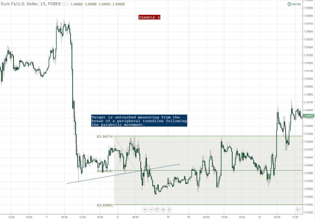
So no success there, but for the reasons stated above. We only have 2 hits on that trendline, so can we even consider it valid? The easy answer is no: look for a minimum of 3 touches, above or below. The more confluence, the better.
So in this same example we do have something of interest: an inner trendline with more hits than the “obvious guess”.
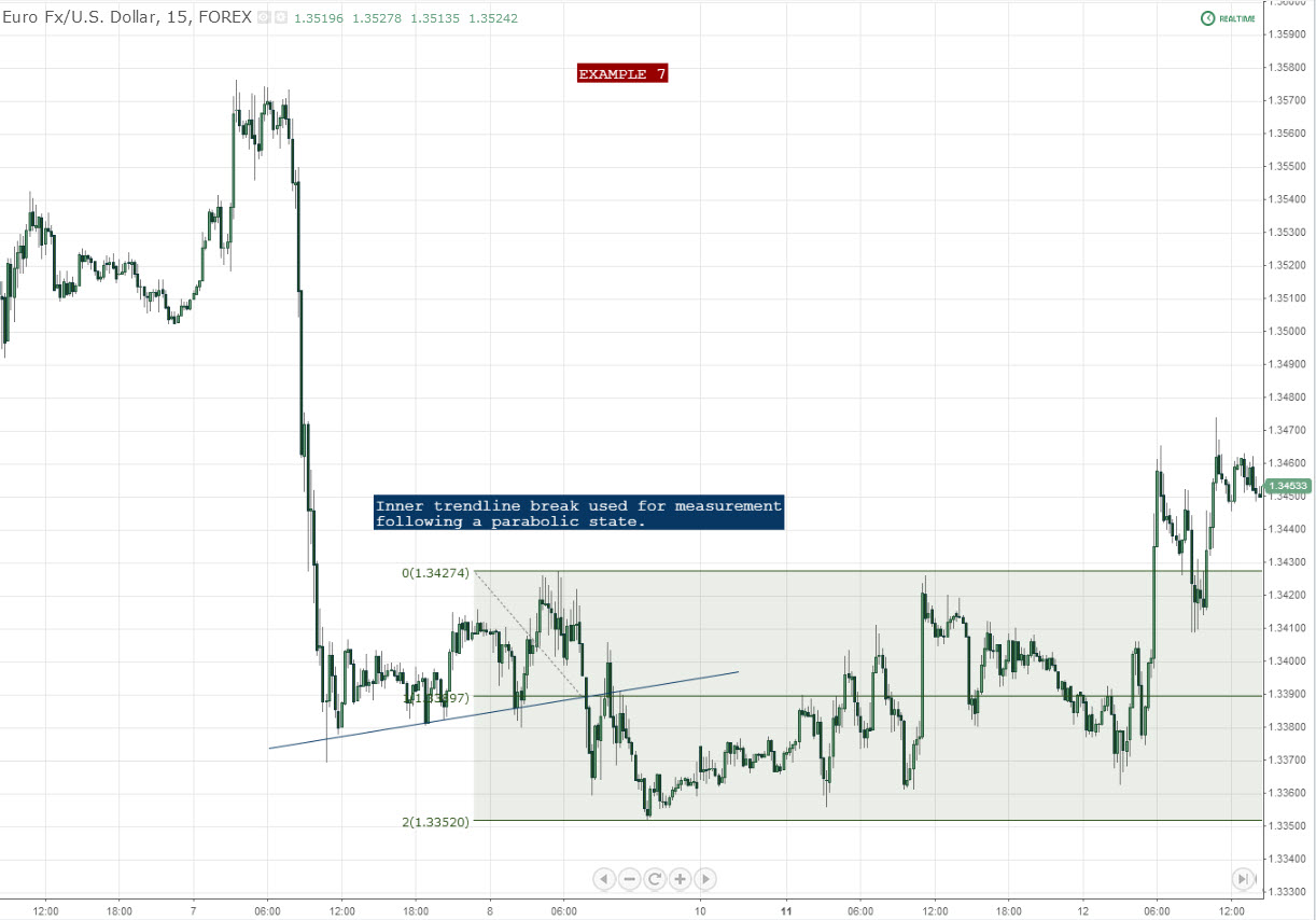
Confluence. You can see that the inner trendline had more hits, so essentially you're basing your future decisions off of this mark.
Second, a general scenario comes to my mind when it comes to projecting future movements within a trend:
You can generally cut most trends up into at least 3 major legs. Take a look at this article and go to the section about Fanning to better understand this. Whether it is the 3rd leg, or a hard spike, realize that most of the “work” is now done for the day or week and that any ranges created at the base of these aren't likely to go much lower too soon. Just be conscientious of the fact that you might be establishing a position near a potential exhaustion point. Using confluence in the break is one way to confirm this, however, as shown above.
One final major thing you want to be on the lookout for are simple V tops and bottoms, driven by some form of economic surprise that the market essentially hasn't “priced in”. This is a forward-looking market. By the time the news hits the wires, participants have already traded price to where it “needs to be”. V tops or bottoms are typically driven by:
1. A market taking something for face value moments after it gets released (eg price sharply moves lower), then later “digesting” it, and realizing the longer-term direction should be the exact opposite (eg price sharply moves higher).
2. Unexpected data or announcement completely interrupting a previous move.
When these happen, one move is interrupted by another, and many technicals have now lost their value.
For price targets only, you can also shave off the “wicks” of the peak or trough as well, but just realize that when you do something like that, your reward to risk ratio drops.
Here's one final recent example to drive this point home using 2 instances of Variant 1:
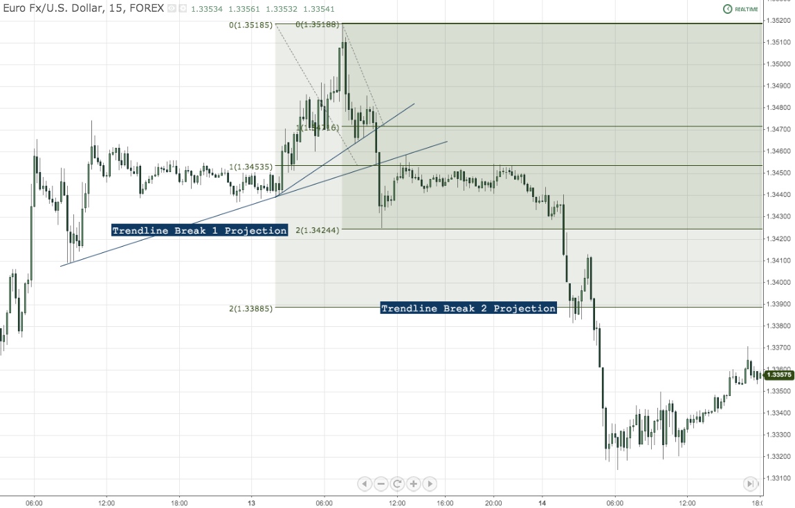
Again, look for the line that gets the backward retest or heavy historical hits and use it as your meter. This is one thing that I wish I knew in my early days of using this.
Essentially you can work your backwards when establishing the proper broken trendline to use for measurement. Start with the retest (if there is one) or most historical hits (inner or outer trendline). In a live trading environment your process is going to look something like this:
1. Position taken long or short.
2. Take profit immediately placed in a conservative zone based on the assumption of a secondary trendline being broken (but not the steepest – those break almost instantly).
3. When broken / retest received, fine tune your take profit. You have more information now, so you mine as well use it.
How to Apply These
Last week we discussed how to bridge the gap between learning and application in trading. I'm making this a huge focus these days because literally just about everyone drops the ball in this department.
My recommendation for picking up this habit is to start off easy, and like I had to when coming with these examples today: dig through your market history and just draw. Zoom in on the first reversal you see and apply. Once you become somewhat acquainted with the way it works stop right there, and start drawing these on live charts. You MUST look forward in order to learn this or any other concept properly, in my opinion. You are going to squirm a bit because you're not used to it yet, but you will be over time. Also, we're not done with these yet here on NBT. Please don't start fading the bottoms of these thinking that all will be well, in any circumstance – more on that later.
So without flooding this post with even more charts, I encourage you to go out and start exploring your territory with these. Your own experience will matter most anyway and the list above can be considered the bulletpoints. Measured movements can serve a variety of purposes, and this is just one of them. There are many more to discuss, and will be done in future writings.
Additional Resources
For more reading on this topic, well, there isn't much, despite its value (isn't this typical). As discussed above, Variant 3 is the most discussed, and my personal first introduction to it was many years ago, by Tom DeMark. And I can't say if he's the original source on this – I truly have no idea. His means of describing it was, however, unique, as he seeks out strictly objective ways of doing it.
Variants 1 and 2, as well as stipulations in the last section, are my own creations based on the pleasure of pain over the years working with these.
To my knowledge, Variant 3 is discussed by DeMark and Tom Bulkowski, but both have their own means of using diagonal trend lines. And not to criticize their studies (and I truly mean this), I have simply found more value seeking higher confluence in the broken trendline (example, Tom DeMark uses TD Points to draw his, which I generally don't use for pinpoint execution on retests). Lastly, the term “Measured Moves” itself, after some quick Google searching, dug up only one name: Al Brooks. I quickly searched and found that this topic (and more about is covered in his second book “Trading Price Action Trading Ranges”) albeit not as much as I would have liked but still a good “heads up”. I purchased and read the entire book last week and he really jives well with many of the topics we discuss here. And he even covered some of the topics I intend on discussing in the future with these, but again, not specifically to the form I prefer, based on my experience in this market. As I said earlier though, I like insurance on my trades as much as I do precision, and that's why I have options and go to the extent that I do, listed above.
—————————————————————————-
If you have questions, input or anything else to say, please use the comments section so that everyone can benefit. If more explanations are needed I can update the post after it's digested by an audience. Also feel free to post your own examples by using links in any comments.
Finally, sharing our posts and raising awareness helps us out tremendously. We are still trying to regain traction from our recent fallback in posts, and it's very much appreciated. Thanks again for stopping by,
-Steve
Chart sources: https://www.tradingview.com/


