We have discussed inner trendlines over and over again on this site, and it became obvious to me that the idea is only loosely seeded at best. And so today we are taking a step back, explaining the relevance, importance, and best practices for drawing these very precise turning points on your charts.
Many people view what I do with trendlines as either haphazard or done with the benefit of hindsight. One of the reasons I set up the new board was so that I could actively post more charts demonstrating these types of things before they occur.
The bulk of my trading activity is based on simple trendline breaks and fades. The purpose of this post is to simply clear up common, go-to methods to wipe away ambiguity.
Rookies and the World of Ambiguity
Rookie traders miss a lot of important detail on their charts, and much of this could attributed to the wide range of strategies available to them which directs ambiguous or otherwise vague trading decisions. One of the reasons this website took off in the first place was due to our ability to find precise turning points via horizontal support and resistance.
The methods used to find these levels are really no different for diagonal trendlines, with a few exceptions. The primary difference with diagonal trendlines is that more opportunity presents itself as their ability to act as price turning points is very common.
I always tell people to “look inside the range”. Price rarely bounces off of external points. It typically enters a previous price range prior to reversal or continuation.
To find those points precisely, we use the following:
What's In An Inner Trendline?
Inner trendlines are simply trendlines that are drawn “inside” price, not simply higher highs or lower lows (as in “TD points” or “fractals”). Statistically, they are much better performers, and below I will explain why. When we learn how to trade, we are taught that “fractals” are the way to go in terms of drawing support and resistance, whether horizontal or diagonal. This is the conventional thought, taught by thousands and adapted by millions. This assumption, however, is a very dangerous one, as it tends to blur the already vague in terms of reactionary levels.
We tend to end up using inner trendlines for one sole purpose: cleaner and earlier entry on a reversal or continuation. Because they are drawn on the inside of price, it of course takes less time for price to get to it, cutting down on missed opportunity. They also provide us with better direction in terms of clean retests.
Simply stated, it does not matter whether your support and resistance level is drawn inside price (inner trendline) or on the periphery (outer trendline). But one things does:
Confluence – The Root of All of Your Decision Making
Confluence is at the heart of everything we do. It is a word that gets used a lot but rarely in the proper context. Confluence refers to a multitude of factors lining up at once, creating a situation of harmony and providing us with guide for future decision making.
When we talk about confluence in regards to finding support and resistance levels, we are seeking hit, after hit, after hit, after hit, on a specific level or price range/trend. Simple.
Confluence is the mother of all support and resistance trading as far as I am concerned. The method for drawing any line on a chart should really boil down to a confluence of factors, whether they be measured moves, or horizontal or diagonal support and resistance.
Look for the hits. I cannot count the number of times I have stated this on this website now. One of the more common FAQ's I get is “How do I find the best support and resistance levels?”. CONFLUENCE. It really is everything. It is not hard to identify, and most people could adapt themselves to it in a very short amount of time.
Very Important: Work Backwards
Always start from the here and now, and work backwards. I can't stress this enough. Not only are you going to save yourself heaps of time, but you will also be finding what is the most relevant at any particular moment.
The points closes to price are always the most relevant. People that tend to start from the left of their screen and work forward tend to miss a lot of important detail. Essentially you find yourself always waiting for something that might or might not occur, instead of focusing in on what is.
Working backwards has tons of advantages, regardless of the strategy being used. Again, it primarily boils down to focus on current happenings. Having your macro scale / important levels set up is of course important, but to clearly define entry you want to have local pressure working well in your favor.
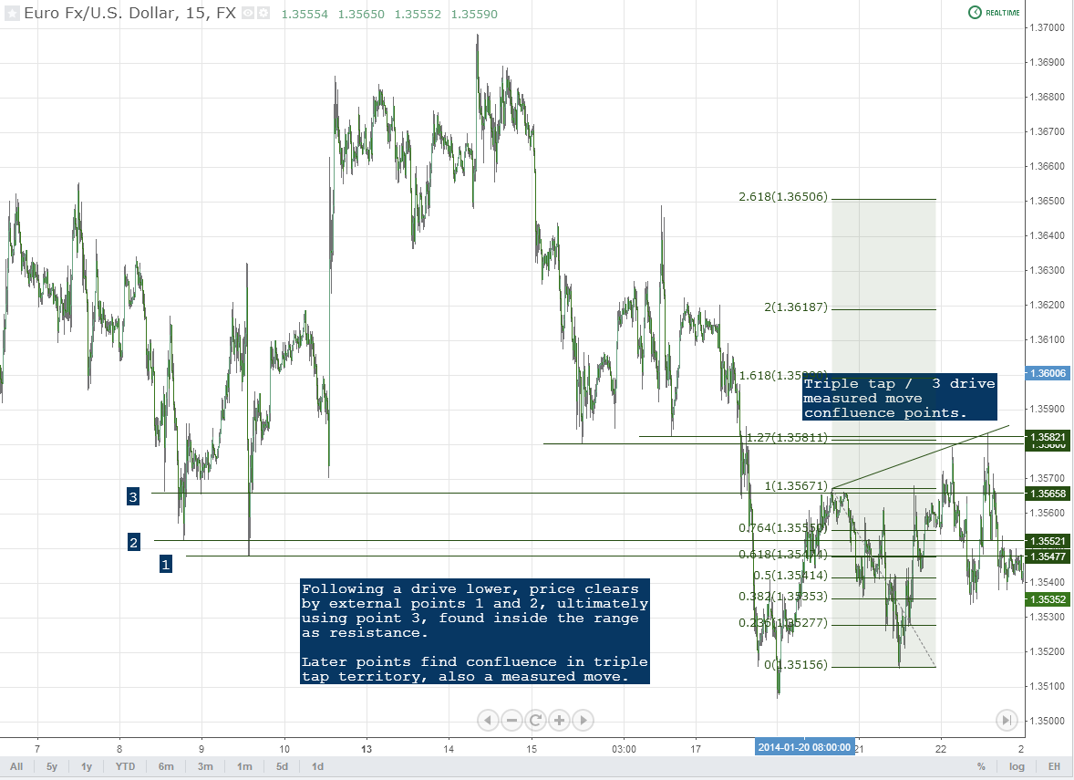
Voids and Targets
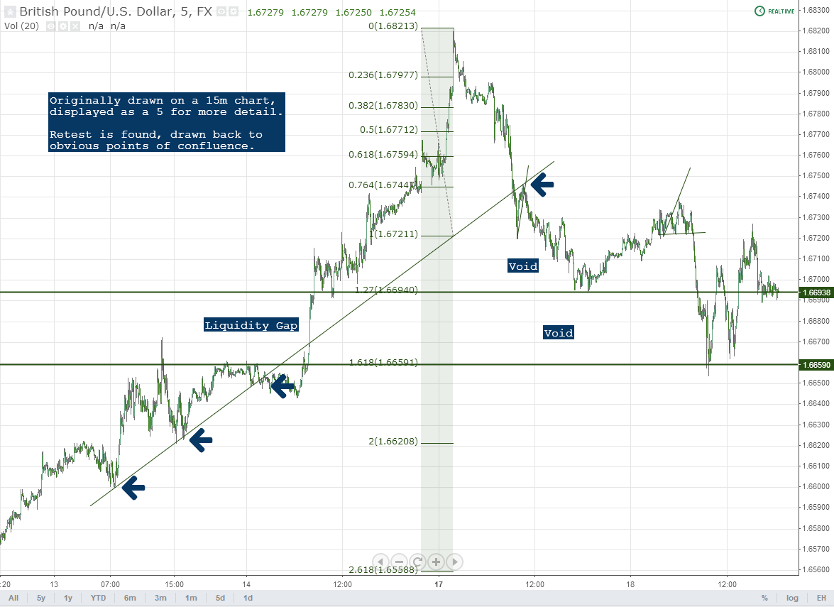
Voids are “empty” price areas in which no major support and resistance levels are present. When I think in terms of targets, I am also thinking in terms of voids. Voids are where the money is made. Trendline breaks allow us to trade the voids. As an example, here is a recent chart on GBP/USD that was just posted to our board and cleaned up for the purpose of this post. The voids, in this case, are the areas between the key extension levels. Trading through them is where you find your pay.
Entry can be taken after a restest using either local trendlines or simply individual bar or 123 type patterns.
Find The Hits
This is relatively straightforward. Most charting software has a “Ray” drawing tool. It allows you to anchor one point, while you find others. Use it instead of your typical trendline tool. Once again, it will save you aggravation and time.
Anchor the mid point of the ray to a local point which clearly will line up with past history. This is the last time this line was hit. Take the other end and slowly drag it up and down your chart so that you able to identify which line simply matters most. These lines that “matter most”, again, refers to confluence.
Avoid the “wicks” of your candles or peaks on your bars. You want to get as close to the root as possible. Find what matters most.
And I Know This Is Messy, So Here Is How You Clear Things Up:
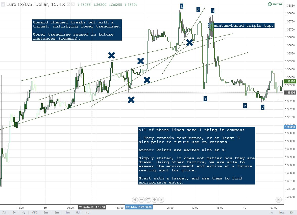
The charts above are messy, to say say the least, to most people. I draw these lines to exemplify the sheer number of times they get used. Clearly, as in the example above, you can't simply fade or play a breakout on each one without experience some serious hits along the way: it is impractical.
Inner trendlines are of course best used in a contextual sense, and in times of higher liquidity. I use them most when I asses entry upon the completion of a trading range. In other words, a trading range has completed a full, standard cycle (3 hits in opposing directions) and I am seeking the next thrust / breakout.
I typically wait for them to register a retest. When the retest is complete, so is my entry. Again, individual bar patterns or 123 type patterns as well. There is a weighted scale that gets used here, and inner trendlines are used more in the sense of entry on a preexisting idea than anything else. Targets come first.
Additionally, I only trade my macro idea. This is important, and when overtrading tends to kick in for most people. Drawn in by the number of trendlines and other factors, some people are inclined to trade “micro” movements.
In other words, they will say something to the effect of “well I know price is going here eventually, but it is going to go here first, and I can make money doing that, too.” What results are usually unnecessary losses. This is picking or scalping, something which really shouldn't be done by most discretionary traders. The larger movements are what always moves the equity curve upward.
For Measured Moves on Trendline Breaks: Find the Retest, and Use It!
90% of the questions I get in regards to our measured moves on trendline breaks can be answered with one phrase: find the retest. I didn't stress this enough in our original article on the topic. This is exemplified in the GBP/USD chart above. While slightly related to what we are discussing here, I wanted to state this yet again in order to highlight its importance.
Using a trendline with a lst leg retest ensures you are on the same page as the rest of the worls. You can go back, find your confluence, and work forward.
Closing Points
To recap, we want to do the following:
1. Work backwards on your chart (right to left) – local points always hold the most relevance and remove unnecessary noise by eliminating the option of support and resistance levels that have no use in the here and now.
2. Find an anchor point – this is typically the last high or low in which price was hit along your trendline
3. Find the confluence – use the line that lines up with the most historical hits
4. Trade through the void and target the major levels – your major levels can be derived in any number of ways. We recommend measured moves and horizontal support and resistance holding key confluence.
Conjunction with other methods is the key here. We want to ensure that we're looking at this contextually so not to be thrown off by a slew of complication. Seek your targets, and use inner trendlines as a means to get there.


