Everyone needs a reality check every once in a while to take a step back from what they are doing and reflect on their strategy, risk, and overall trading methodology. One of the easiest ways to do that is to compare yourself to the rest of the industry and take a look at what other comparable traders are doing.
So getting aside from the huge, one page ads offering you a 50,000% return in 5 months using their trading system, let's take a look at some other traders in the world and see how we measure up.
The Barclay Currency Traders Index is a “composite of managed programs that trade currency futures and/or cash forwards in the inter bank market”1. (and it's usually great if you ever need an ego boost).
Barclay Hedge does a good job of attracting money managers into their database, as their products are used by a large number of IB's and investors worldwide. While a broad stroke of the market, their indices provide investors with an arsenal of knowledge about who is doing what and can potentially bring a lot of ‘dark horses' into the light. Be aware that not every managed currency account is going to get listed on this index. Only those who opt in actually get listed, and some of them don't necessarily list all of their programs. If you follow the links at the bottom of this post you can see how many are actually reporting, broken down by index. Regardless, it provides a good stroke of what is going on in the world of these accounts.
So enough chit chat, let's look at the numbers. Everything below is represented in the traditional industry standard, or VAMI (Value Added Monthly Index or Previous VAMI x (1 + Current ROR) based on a $1,000 hypothetical investment. You can see that for the past 10 years the index has fared relatively well, while tapering off a bit since the credit crisis. But compared to the equity markets, I think it is safe to say that most people would have preferred this performance.
 Source: BarclayHedge

Trying to Buy a Mansion With Enough Capital for a Bus Ride
As a writer who has had a lot of contact with traders of all shapes and sizes, the first thing that comes to mind when I look at this information is how skewed the market is, particularly the retail market, in terms of out-performance of other investment vehicles. In other words, people seem to think that they need to triple their investment in a month before they can even think of being considered “good” based on all of the things they read. It's an elementary mentality. Taking a look at the numbers above provides a more realistic perception of where the market stands.
This “striving to be the best” typically results in complete decimation of accounts, driven by uneducated input, a race to trade and poor risk management. Risk management is key to all psychological inputs that drive future actions, and the more the risk goes on the more likely the individual is likely to react negatively when he/she is trying to move ahead.
Holy Smokes, That's a Smooth Equity Curve
The second thing that comes to mind is relatively unrelated, and it refers to the general lack of volatility seen in the first index. It shows us that over time, diversification of all of these traders has been producing a curve that is relatively smooth. For myself, a smooth equity curve is paramount. With as little disruption as possible, you are able to maintain focus and continue moving ahead. While I have a primary method of trading that I stick to regularly, many of you are also aware that I use systematic strategies. It's highly technical, analytical work packed with trial and error that I genuinely enjoy doing, and when the market gets quiet I usually dive in.
The unseen benefit to this is diversification of strategy. While I adhere to my primary method, I have others that execute based on entirely different variables than I would manually. And I notice that as a result of these separate systems in place my equity curve has become a lot smoother. As long as my portfolio exposure and risk are in check and everything looks good on a 30-day cycle, I only see benefit to this type of allocation.
Huge Gains and Mammoth Losses
The third thing that comes to mind takes looks at volatility in the other direction, or on a smaller scale. Below is a snapshot of the index showing the highest and lowest ROR, with the average listed right in the middle. You can see that we are dealing with some enormous swings in terms of performance, and while these numbers might very well be anomalies, they are still the numbers of accounts actually being traded.
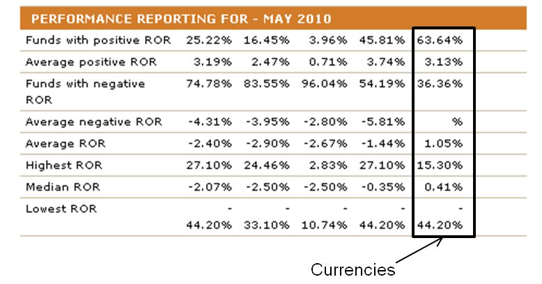 Source: BarclayHedge
Whatever systems the biggest gainers and losers are using, the fact of the matter is that in either direction, its a lot. And given the fact that the average falls right above the unchanged mark, it proves that a controlled methodology in terms of risk and fundamental strategy can outperform this index when implemented properly.
Conclusion
While we all love to hear the ‘big fish' stories that get posted in newspapers, books and online, reality of the norm is an entirely different story. People tend to focus on these extremes, whether they be good or bad, more than casual, industry-standard performance. When we look at the averages and the volatility in the returns of other traders we can get a real sense and gauge of some true outcomes and position ourselves to swing ahead of them. Consistency over time is what most traders compete viciously for and regular reality checks can help achieve that momentum.
1Source:
Barclay Currency Traders Index
BarclayHedge Alternative Investment Database
2010
http://www.barclayhedge.com/research/indices/cta/sub/curr.html


