A clean graph from Reuters showing IMF projections for 2012 and 2013. Some of the more notable observations from the list: The US was the only country to get an UNCH forecast for 2012 (1.8%,
For those of you seeking some full-time inspiration. A few of our more notable quotes around here. There's no branding on these…we're not that lame. Adobe Illustrator files found below the images so you can
Depending on your overall perception of the world, this might or might not make you want to vomit. It is one thing to read the black and white everyday but another to actually see what
Rhetoric related to credit ratings, and actual upgrades and downgrades have been responsible for some massive currency movements, particularly over the last few years as nation after nation gets sacked with troubles. Mint.com provides us
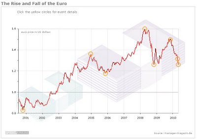
Interactive graph from Spiegel Online highlighting some key movements for the pair. Click the chart to go to the source. Also related from the same site is the following showing ECB shares according to capital.
A focused, Twitter-like discussion community, 81 lectures and true, 1 on 1 support. This site is an in-deep dive and extension to the content posted here and social media, and where I spend the bulk of my time online. Go to https://fxsanalytics.com for more.


IMF Forecasts for 2012 and 2013